A User Interface (UI) is the method in which we interact with an object or service. We use UI's all the time; the dashboard and controls in a car, the keypad on a cash machine, or the dials on an appliance are all examples of a UI. A User Interface is generally designed to enable a user to operate something or complete a task. And all UI's have a User Experience that defines the rules of the interaction.
For the sake of this site the user interface is what is displayed on the screen when the user accesses a product. I work primarily on the design of GUI's (Graphical User Interfaces) such as webpages, online applications, emails, etc.
Before I start to design the user interface I make sure I have the high level functional and non-functional requirements together with the information from the team relating to the build and test strategy.
During the design of a User Interface there are several principals that I also refer to...
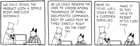
A good User Interface is user friendly, simple to use, easy to understand and intuitive. In other words; fit for purpose. If the product is unusable then it doesn't matter how good it looks or how innovative it is.
There are many myths surrounding what makes a 'good' user experience design, many of which are based parts of UX folklore and are perceived as good practice. In actual fact, there are some best practices, but each solution must be based on acheiving an objective in the simplest manner. There is a site called 'UX Myths' that lists many of these common UX beliefs and explains the reasoning behind them. I find it useful.
The sections below describe several different design methodologies and styles which are frequently used in the design process. I am familiar with each of them and find that using all of them in a project usually produces the best solution;
- base the design around the user interaction,
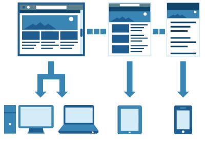
- use a responsive layout that adapts to the users technology,
- use a mobile first methodology to break the process down into smaller tasks and components that can be easily defined and managed,
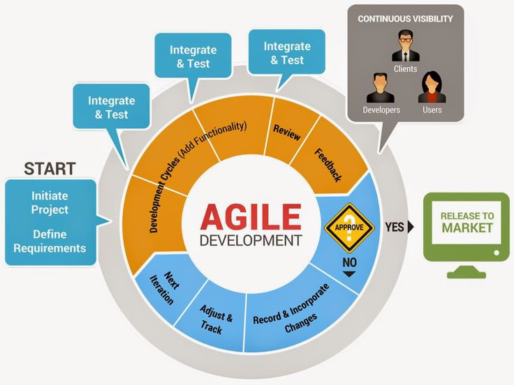
- use an agile approach to managing each task and process.
|
The Interaction Design Associations definition of Interaction Design is as follows: "Interaction Design (IxD) defines the structure and behavior of interactive systems. Interaction designers strive to create meaningful relationships between people and the products and services that they use, from computers to mobile devices to appliances and beyond. Our practices are evolving with the world." So here's my take. Whenever anyone clicks a button, touches a screen or scrolls down a list they are interacting with the system. So how does Interaction Design vary from UX or UI Design. I wondered about myself for a bit, then realised that there is a heirachy in the design process. The user experience sits on the top, then the design of the user interface then the design of the interaction. So, within a team, you may have a UX Designer who carries out some analysis and determines what the user will experience. He/she will pass this down to the User Interface Design who will work up some screen flows and the user journey. Then this will be passed to the Interaction Designer who determines the most effective method of relaying this functionality to the user. So where do I sit in this process... what type of designer am I? Well, I would like to say all 3. It comes down to the size and complexity of the project, and how much value can be added by having them as distinct roles in the process. |
 |
|
When I started designing User Interfaces users operated on desktops with large cumbersome monitors that displayed content in 256 colours at a resolution of 800 x 600. Technology was predominently used in the office environment so peoples exposure to online applications and knowledge of systems was limited so the 'user experience' did not have the impact it has today. Compare that to the present day where we all have laptops and tablets, and carry a computer around with us all the time. As internet and online interaction has become an increasing part of our everyday lives, users are far more tech savvy, have greater expectations and are familiar with the interfaces used on the latest gadgets. Every business, regardless of its size and scope, has had to adapt to the needs of the modern users and proactively design new and more effective ways of delivering content. |
 |
Coming soon |
 |
Coming soon... |
 |
There are many levels and styles of prototyping ranging from a 'lo-fidelity' paper scribble to a 'hi-fidelity' functional repesentation of the solution that demonstrates the concept in more detail. A certain type of prototype is generally used at different times in the project, so I would use a white board as a canvas in a workshop to quickly show an idea or a concept. Once we had agreed on a concept I would use wireframing to indicate the screen flow, screenshots (created in a graphics tool) to illustrate the appearance of the pages, and HTML, CSS and JS to create working prototypes.
- Scribble on paper
- Screen Flows
- Wireframing
- HTML Prototypes
This section describes each of these types and when I would be likely to use them.
|
In the inital stages of the project when an ideas need jotting down quickly this is a good approach. I have a drawing pad at the side of my desk that I use at the beginning of every project just to empty my brain quickly. Some of the best inventions and orations started life as a scribble - Lincoln wrote the Gettyburg Address on the back of an envelope, and the first nonstop non-refueling round the world aeroplane and even Harry Potter started life on napkins. |
 |
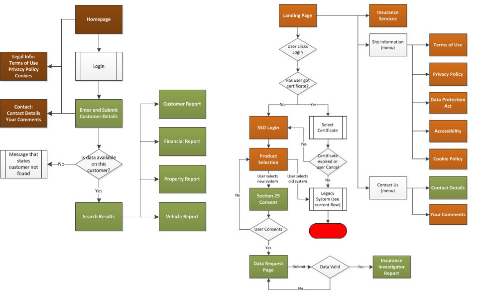
A screen flow is a good way to illustrate the journey of the user through the system. They can show varying degrees of detail and can be used to describe fairly complex user interaction scenarios. Microsoft Visio is one of the most common tools to create flow diagrams as it makes it easy to incorporate them into other documents. The image below is a typical example of a simple flow that shows how a user might navigate through several screens to get a report. |
 |
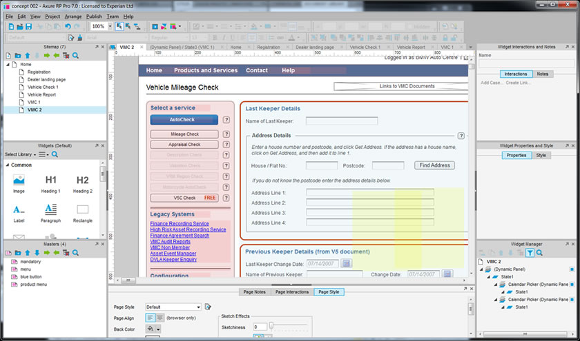
A wireframe is a mockup of the system that illustrates the screen flow, the key elements on each screen, and the user interaction. Axure is a tool that is commonly used by UX and UI Designers as it enables them to emulate a variety of use scenarios using basic HTML and CSS. The example below illustrates the Axure software tool and a fairly simple design for an input screen. |
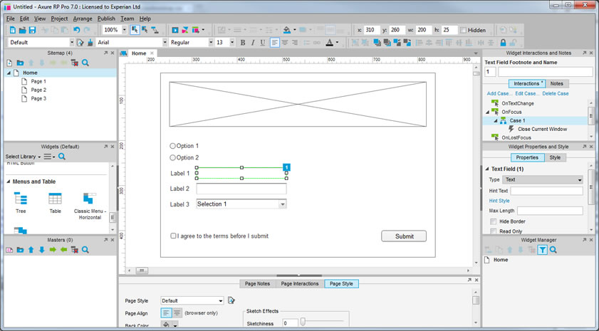 |
More complex functionality can be added together with some styling if required. |
 |
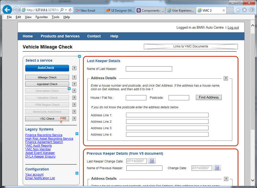
This example shows a published view of the same screen. Another advantage of this tool, or others like it, is that the mockups are transportable and can be viewed without any 3rd party tools, so a wide audience can be used in the evalution. |
 |
On larger projects which may include complex user interactions and muti-layered functionality, it might be advisable to create a fully working prototype. Whilst this seems like a costly excercise, if done correctly the code can be reused in the actual build so it can actually be quite cost effective. An typical example of a html prototype is the site you are now looking at. It has been created by a designer (not a developer) using HTML, CSS and a responsive layout provided by Bootstrap. As you can see, it provides a view of the key elements of a final site, including the navigation, styling, user interaction and functionality that is required in the final solution. THe code under the hood can be refined during the development stage but the bones are there and it provides a good foundation for trying different styles and features. |
 |
Interaction Types
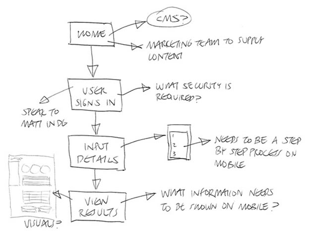
When you are creating a screened application, the user journey is argueably the most important document that is produced. It describes the end to end process of the solution design, showing each screens, every screen state and all of the use cases. It is important that every scenario is documented as the design is based around the known limitations of the system. The UJD is also very useful to get signoff on the design as it provides a visual representation of the solution and is presented in a user-centric format.
The docs below are typical examples of UJD's and describe each process in clear, non-technical manner.
A Design Guide is a high level document that is generally not project specific, used within a department to define a group of products or a set of generic processes. For example, a Design Guide may describe the structure of the site, the elements that would generally go on a search page, or the attributes of each table on a site.
Guess what, a screen specification specifies the screens. Unlike the User Journey which focuses on the usability, a screen specification is a bit more technical as it is used alongside a Design Guide to buid the solution. It contains information about each screen such as a description of the interaction, but also the definition of the on-screen elements; size and shape of buttons, hex values of colours, customised CSS styles that will be needed, etc.
In many organisations, a Functional Specification (FSD) is prepared by a Business Analyst. This describes all of the requirements and functonality that is needed in the final solution. In smaller companies, or projects where the screen design is a key requirement then the UX Designer may write this doc. I have written many FSD's over the years and am familiar with the prepartion and content.
I have mentioned in other sections that the most fundamental aspects of UI Design is the screen flow, and stringing together a number of processes or 'tasks' into a 'user journey'. This will help to identify all of the interaction points and potential issues. Now here's where the design can grow in complexity. Not only do different users interact with the system differently, but they also act differently depending on the task. So the way in which a user views an input page and an output is quite different so it is important to determine the type of interaction that will take place on each page.
For example, a typical user journey might include a homepage, followed by an input page then an output page.
- Information (Landing page, marketing page, Homepage)
- Input (Enter details, Search, Selection)
- Results (shows the details of a search or a confirmation)
- Output (Reports)
- Other screens such as Decisioning/Underwriting, Payment Processing and Data Visualisation.
|
In the inital stages of the project when an ideas need jotting down quickly this is a good approach. I have a drawing pad at the side of my desk that I use at the beginning of every project just to empty my brain quickly. Some of the best inventions and orations started life as a scribble - Lincoln wrote the Gettyburg Address on the back of an envelope, and the first nonstop non-refueling round the world aeroplane and even Harry Potter started life on napkins. |
|
|
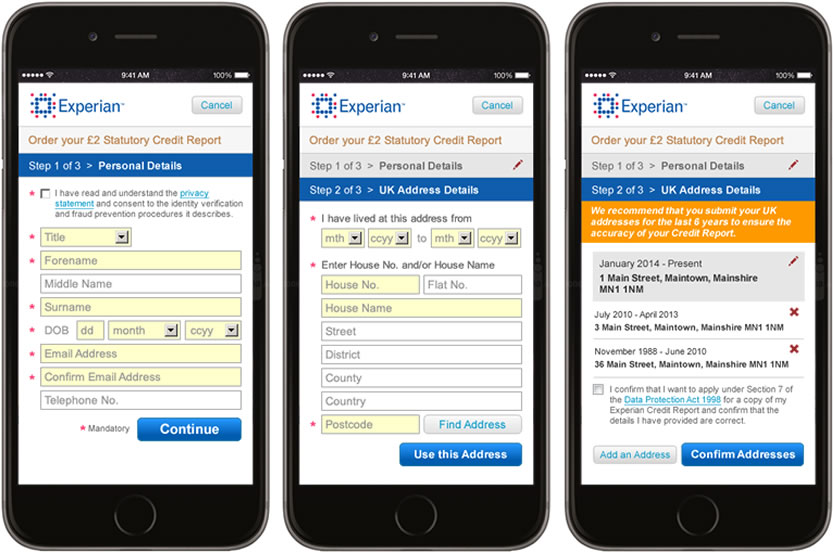
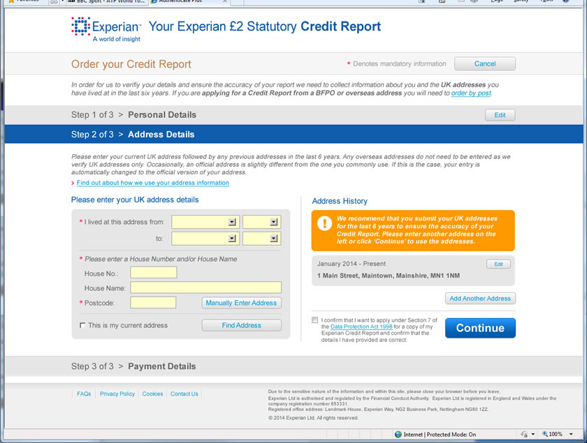
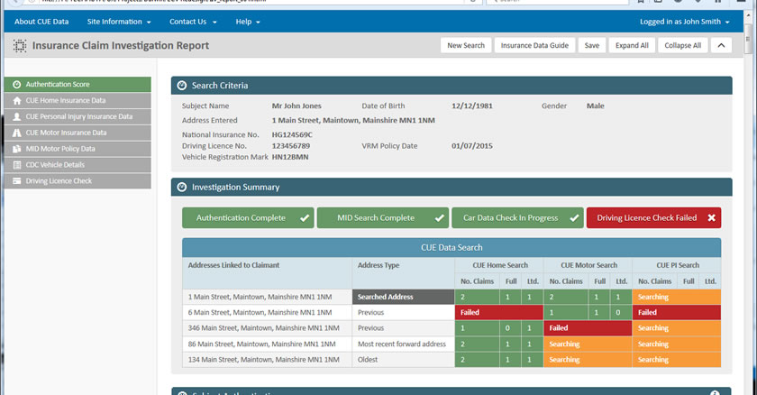
This is another data input screen that follows a similar requirement but the process has been broken down into steps as there are certain points tyat a call to the database needs to be made before the user can proceed. It is important for the UI Designer to understand this detail, and also whether the data they have entered in the first step impacts the second step, etc. The User Journey guide for this application describes all of the screen in the process and the interaction such as error handling and user assistance. |
 |
|
A screen flow is a good way to illustrate the journey of the user trhrough the system. They can show varying degrees of detail and can be used to describe fairly complex user interaction scenarios. Microsoft Visio is one of the most common tools to create flow diagrams as it makes it easy to incorporate them into other documents. The iamge below is a typical example of a simple flow that shows how a user might navigate through several screens to get a report. The User Journey guide for this application describes all of the screen in the process and the interaction such as error handling and user assistance |
|
|
A screen flow is a good way to illustrate the journey of the user trhrough the system. They can show varying degrees of detail and can be used to describe fairly complex user interaction scenarios. Microsoft Visio is one of the most common tools to create flow diagrams as it makes it easy to incorporate them into other documents. The iamge below is a typical example of a simple flow that shows how a user might navigate through several screens to get a report. The User Journey guide for this application describes all of the screen in the process and the interaction such as error handling and user assistance |
 |
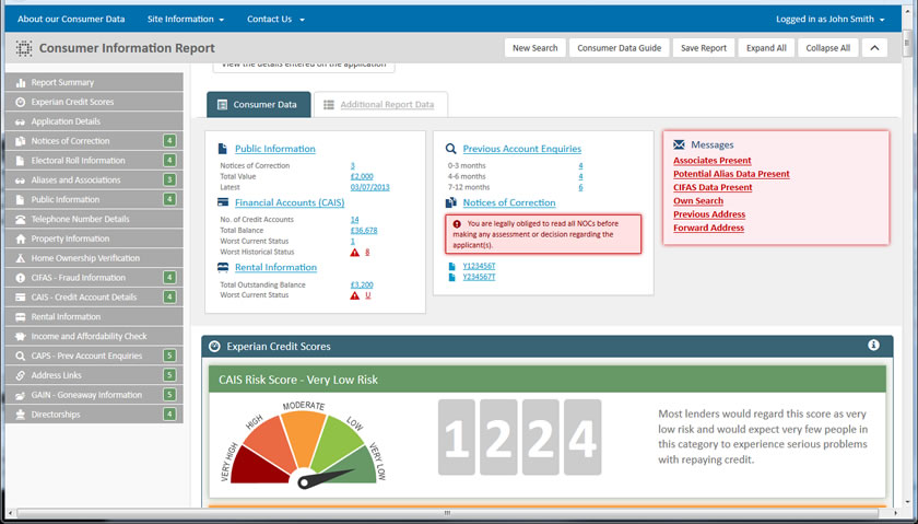
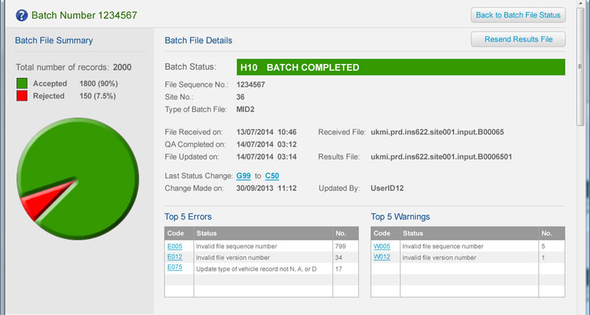
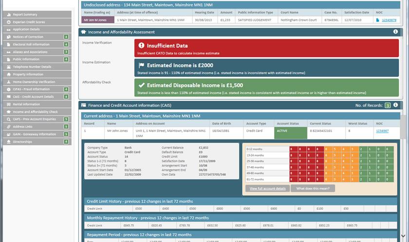
A results screen will generally present the output of a search, trace or investigation. This could be presented in simple tabular format or as an elaborate dashboard depending on the product. I have designed both but the principals of a results page will always be the same. The user must ne able to view the information that is relavent to them in a clear, understandable manner. |
 |
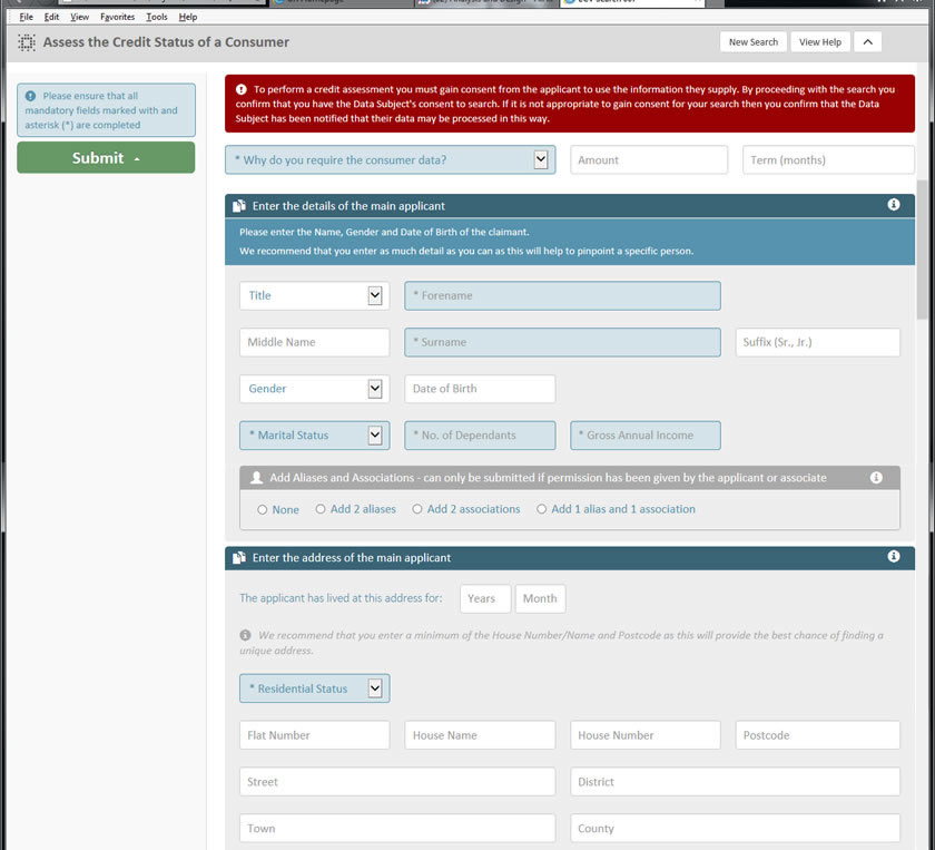
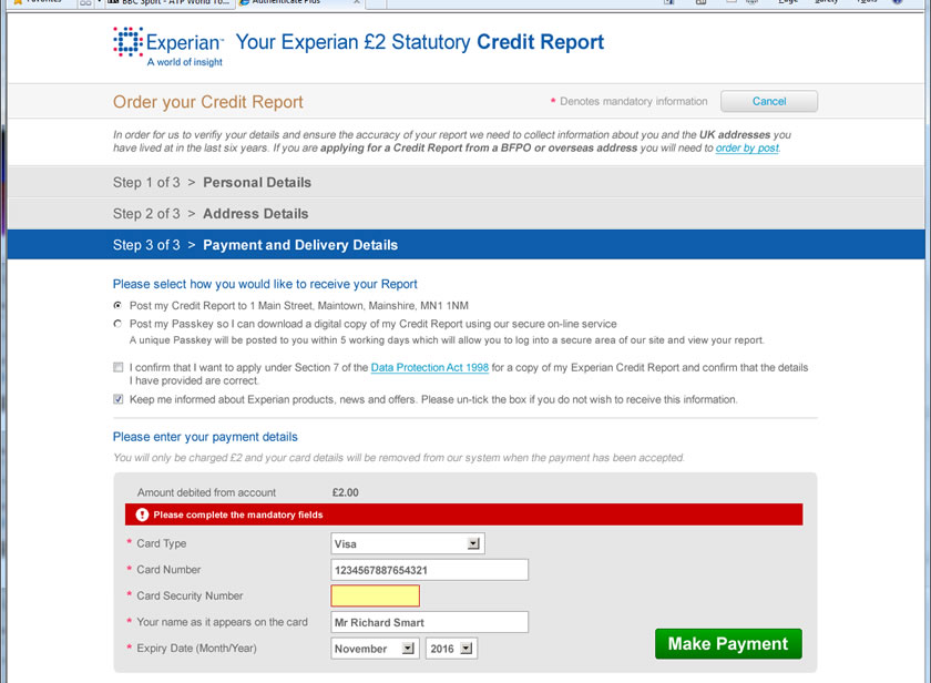
This is an example of an input screen for a consumer credit assessment request. It is a fairly simple process that asks for the name and address. It is made slightly more complex due to the requirement that the user cam enter aliases for their names, additional applicants and multipe addresses for both. One of the main things to think about in this scenario is not to ask the user for all of the information, but just what they want then open additional data input panels if necessary. The User Journey guide for this application describes all of the screen in the process and the interaction such as error handling and user assistance. |
 |
Specifying the User Interface
The 'Specifying the User Experience' topic described the UJD (User Journey document) that is created to define and support the design of the User Experience. This was essentially a walk through of the application with a description of the user interaction, and how the system will react to a given scenario such as a button click or an error.
The User Interface specification is similar to this document but needs the additional information required to build it. So the developer needs to know about colours and exactly how we expect a widget (such as an expandable panel) will work. Now different developers do things in different ways, and it is always good to allow a bit of flexibility so they can interogate the design and, if necessary, propose a better method of doing something based on their knowledge of coding.